- How to Customize Gantt Chart Bar Appearance in Primavera P6
- Formatting Gantt Chart Bars: A Step-by-Step Guide
- Tailoring Your Gantt Chart: Adjusting Bar Size and Color in P6
- Enhance Your P6 Gantt Charts: Customize Bar Style and Color
- Mastering Gantt Chart Customization in Primavera P6
- How to Modify Gantt Chart Bar Attributes in Primavera P6
- Customize Your P6 Gantt Chart: A Visual Guide
- Personalize Your P6 Gantt Charts: Adjust Bar Size and Color
- Optimizing Gantt Chart Visuals in Primavera P6
- Creating Visually Appealing Gantt Charts: A P6 Tutorial
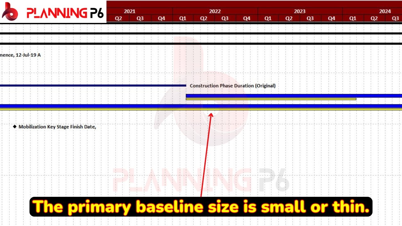
We will delve into a common query: how to adjust the size and color of bars within a Gantt chart in Primavera P6. While we’ve previously addressed this topic in a YouTube tutorial, we’ll provide a detailed explanation here as well. This blog post will guide you through the process of increasing, decreasing, and customizing the appearance of specific bars in your Gantt chart.

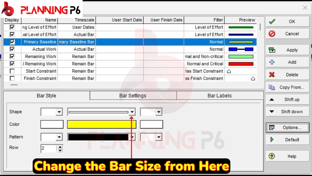
To modify the size of a specific bar within the Gantt chart, follow these steps:

- Right-click on the Gantt chart to access the context menu.
- Navigate to the desired bar within the chart.
- Click on the specific bar you want to adjust.
- Select Bar Style from the context menu.
- Locate the “Bar Style” option.
- Click on the arrow icon next to the Bar Style option.
- Choose the desired size for the bar from the available options.
- Apply the selected size.
Additionally, you can customize the appearance of the bars in various ways:
- Color: Change the color of the bar to differentiate it from others.
- Visibility: Completely hide the bar if necessary.
- Bar Head Style: Apply different styles to the beginning and end of the bar, such as open, closed, or custom shapes.
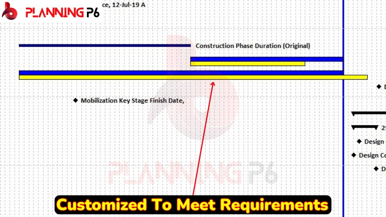
By following these steps, you can effectively tailor the appearance and size of individual bars within your Gantt chart to suit your specific needs.

As depicted in the image above, adjusting the size of the bar chart results in a corresponding change in the size of the ball chart. Similarly, customization options extend beyond mere size adjustment; you can employ custom bars or introduce entirely new bar types. This feature is particularly useful for delay analyses, where differentiating bars with distinct colors enhances visual clarity. Detailed explanations regarding delay analysis techniques, including the use of Gantt charts, are provided in our dedicated video tutorials. Should you encounter any difficulties, please do not hesitate to contact us for further assistance.


